Stop Building Admin UIs From Scratch: shadcn-admin Exposed
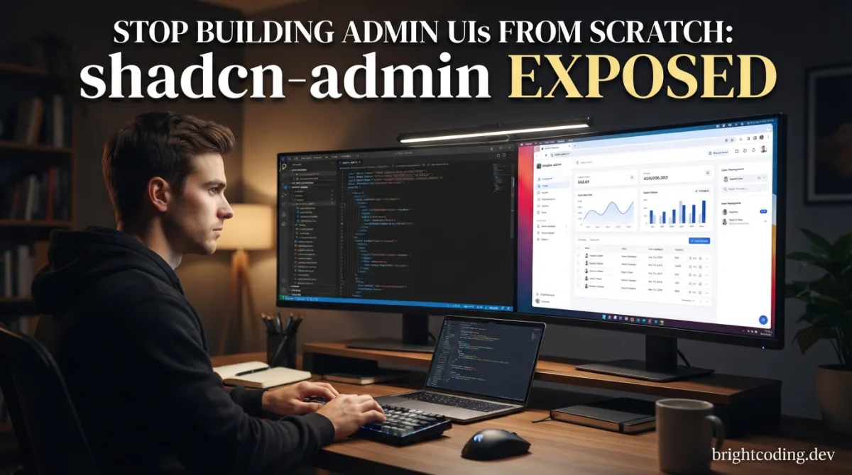
What if your next admin dashboard took hours instead of weeks?
Here's the brutal truth that nobody talks about: developers are burning 40+ hours on admin interface boilerplate before writing a single line of business logic. The sidebar navigation. The dark mode toggle. The responsive data tables. The global search that actually works. We rebuild these same patterns project after project, like some cruel Groundhog Day of frontend development↗ Bright Coding Blog.
I was trapped in this cycle too. Then I discovered what senior engineers at fast-moving startups are quietly doing—and it's not writing more custom CSS.
Meet shadcn-admin. Not a bloated template framework. Not another component library with opinions you don't need. This is a production-ready admin dashboard UI crafted with Shadcn UI and Vite, built by someone who was just as exhausted by repetition as you are. Creator Sat Naing built this after years of building dashboard UIs for work and personal projects, finally deciding to make something reusable for future projects. The result? A lean, accessible, responsive foundation that you can clone and make entirely your own.
In this deep dive, I'm pulling back the curtain on exactly why this repository is gaining serious traction, how to get it running in under 5 minutes, and the advanced patterns that will make your implementation stand out. Let's get into it.
What is shadcn-admin?
shadcn-admin is an open-source admin dashboard UI built on two of modern frontend's most powerful technologies: Shadcn UI (the copy-paste component revolution) and Vite (the build tool that made Webpack feel ancient). Created by Sat Naing, this project represents a philosophy shift in how we approach admin interfaces—away from rigid templates and toward composable, maintainable foundations.
The repository has struck a nerve because it solves a specific pain point with surgical precision. As Naing notes in the README: "I've been creating dashboard UIs at work and for my personal projects. I always wanted to make a reusable collection of dashboard UI for future projects; and here it is now." This isn't corporate marketing speak—it's the authentic origin story of a tool born from real frustration.
What makes shadcn-admin particularly compelling in 2024's landscape is its intentional minimalism. Unlike admin templates that lock you into proprietary component systems, this project uses standard Shadcn UI components with strategic customizations. You're not learning a new API—you're extending patterns you already know. The project includes 10+ pre-built pages, a built-in sidebar component, global search command, and RTL support—features that typically consume days of development time.
The tech stack reads like a who's-who of modern frontend excellence: TanStack Router for type-safe routing, TypeScript for bulletproof code, ESLint and Prettier for code quality, and Lucide/Tabler icons for consistent visual language. The partial Clerk authentication integration shows real-world pragmatism—enough to demonstrate patterns, not so much that you're fighting to rip it out for your own auth solution.
Critically, Naing is transparent about what this is and isn't: "This is not a starter project (template) though. I'll probably make one in the future." This honesty matters. shadcn-admin is a reference implementation—a working dashboard you study, adapt, and evolve. The real value isn't in cloning and deploying unchanged; it's in understanding the architectural decisions and making them your own.
Key Features That Separate It From the Noise
Let's dissect what actually ships in this repository and why each feature deserves your attention:
Light/Dark Mode with Zero Configuration The theme system isn't bolted on—it's architected into the component layer from the ground up. Shadcn UI's CSS variable approach means your custom components inherit theme switching automatically. No prop-drilling theme contexts, no jarring flashes of unstyled content.
True Responsiveness, Not Just Mobile-First The sidebar collapses intelligently, data tables scroll horizontally without breaking layouts, and the command palette adapts to touch interfaces. This is responsiveness tested against real admin workflows, not just viewport resizing.
Accessibility as Default, Not Afterthought
Every interactive element has proper ARIA attributes, keyboard navigation works throughout, and focus management is handled in modals and dropdowns. The RTL support deserves special mention—this isn't just CSS direction: rtl. Components like calendar, dialog, and sidebar have specific layout and positioning adjustments for right-to-left languages.
Built-in Sidebar Component Navigation is where most admin UIs die. The included sidebar handles nested menus, active state indication, collapse persistence, and mobile overlay behavior. It's the kind of component that seems simple until you've built three versions yourself.
Global Search Command
Powered by the customized command component (adapted from Shadcn UI's examples), this provides ⌘K-style search across your application. The implementation pattern alone is worth studying for your own feature discovery needs.
10+ Production-Ready Pages You're not starting with a blank canvas. The included pages demonstrate patterns for dashboards, settings, user management, and more—serving as living documentation for how to compose components effectively.
Strategic Customizations with Upgrade Paths
The component customization strategy is genuinely clever. Modified components (scroll-area, sonner, separator) have general improvements, while RTL-updated components (alert-dialog, calendar, dialog, dropdown-menu, select, table, sheet, sidebar, switch) can be safely updated via Shadcn CLI if you don't need RTL. This preserves your ability to stay current without losing critical adaptations.
Real-World Use Cases Where shadcn-admin Dominates
SaaS Admin Panels
Building the internal dashboard for your multi-tenant application? shadcn-admin gives you user management scaffolding, settings patterns, and the responsive foundation that works on customer success teams' laptops and phones alike. The partial Clerk integration shows exactly how to wire authentication without prescribing your entire auth architecture.
Internal Tools and Operations Dashboards
The best internal tools die in development because teams underestimate UI complexity. With 10+ pages demonstrating data presentation patterns, you can focus on your specific business logic—inventory thresholds, approval workflows, analytics visualizations—while the shell just works.
Content Management Interfaces
The customized table component with RTL support, combined with the command palette for quick navigation, creates a solid foundation for content-heavy applications. The scroll-area modifications ensure smooth performance with large datasets.
Multi-Language Enterprise Applications
Here's where shadcn-admin quietly outperforms most alternatives. The extensive RTL component modifications mean you're not starting from scratch for Arabic, Hebrew, or Persian deployments. The calendar, dialog, and sidebar RTL handling alone saves significant localization engineering time.
Rapid Prototyping for Investor Demos
Need to show functional admin flows in 48 hours? The pre-built pages provide enough realism to demonstrate product vision without the sunk cost of a bespoke implementation you might throw away.
Step-by-Step Installation & Setup Guide
Getting shadcn-admin running locally is deliberately straightforward. Here's the complete process:
Prerequisites
Ensure you have Node.js 18+ and pnpm installed. The project uses pnpm exclusively—respect this choice for consistent dependency resolution.
Clone and Install
# Clone the repository
git clone https://github.com/satnaing/shadcn-admin.git

# Navigate into the project
cd shadcn-admin

# Install dependencies with pnpm
pnpm install
The pnpm install step pulls in the complete dependency tree including TanStack Router, Radix UI primitives, and all Tailwind CSS↗ Bright Coding Blog tooling.
Development Server
# Start the Vite development server
pnpm run dev
This launches the application with Vite's lightning-fast HMR. Your admin dashboard will be available at http://localhost:5173 by default.
Understanding the Project Structure
After installation, explore these critical directories:
src/components/ui/— All Shadcn UI components, including the customized and RTL-modified variantssrc/components/— Application-specific components built from the UI primitivessrc/pages/— The 10+ pre-built page implementationssrc/lib/— Utility functions and configuration
Configuration Considerations
Before customizing, review the component modification notes in the README's expanded details section. If you plan to use Shadcn CLI for updates, understand which components are safe to update automatically versus which require manual merge attention.
For non-RTL applications, you can safely update RTL Updated Components via npx shadcn@latest add <component>. For Modified Components (scroll-area, sonner, separator), always review changes before overwriting.
REAL Code Examples from the Repository
Let's examine actual implementation patterns from shadcn-admin that demonstrate its architectural quality.
Installation Commands (From README)
The project's setup follows modern conventions precisely:
# Standard clone operation
git clone https://github.com/satnaing/shadcadmin.git

# Directory navigation
cd shadcn-admin

# Dependency installation using pnpm
pnpm install

# Development server startup with Vite
pnpm run dev
These commands reflect intentional tooling choices. The use of pnpm over npm or yarn provides faster installs and stricter dependency resolution. The dev script leverages Vite's optimized development server with instant hot module replacement.
Component Customization Strategy
The README reveals a sophisticated approach to component management. Here's the documented structure for understanding modifications:
# Modified Components (general updates, potentially including RTL)
- scroll-area    # Custom scrolling behavior modifications
- sonner         # Toast notification customizations
- separator      # Visual divider enhancements

# RTL Updated Components (specific right-to-left adaptations)
- alert-dialog   # Dialog positioning for RTL layouts
- calendar       # Date grid direction handling
- command        # Search palette layout adjustments
- dialog         # Modal content flow modifications
- dropdown-menu  # Menu alignment for RTL contexts
- select         # Option list direction support
- table          # Cell ordering and scroll behavior
- sheet          # Side panel slide direction
- sidebar        # Navigation collapse direction
- switch         # Toggle handle positioning
This categorization is architecturally significant. By separating "Modified" from "RTL Updated," the project enables conditional update strategies. Teams without RTL requirements get automatic update safety for 10 components. Teams with RTL needs understand exactly where to apply manual merge attention.
Tech Stack Integration Pattern
The README documents the complete technology integration:
UI: ShadcnUI (TailwindCSS + RadixUI)
Build Tool: Vite
Routing: TanStack Router
Type Checking: TypeScript
Linting/Formatting: ESLint & Prettier
Icons: Lucide Icons, Tabler Icons (Brand icons only)
Auth (partial): Clerk
This stack represents modern frontend best practices without framework lock-in. Notice the "(partial)" annotation for Clerk—this transparency prevents the false expectation of a complete authentication system. You're getting authentication patterns, not a prescribed solution.
The Global Search Implementation
While not shown as raw code in the README, the command component customization enables the global search feature. The implementation pattern follows Shadcn UI's command palette with RTL-specific adjustments:
// Conceptual implementation based on project structure
import { Command } from "@/components/ui/command"

// The command component in shadcn-admin includes:
// - Keyboard shortcut registration (⌘K)
// - RTL-aware positioning via modified dialog primitives
// - Accessible focus management through Radix UI integration
// - Theme-responsive styling through CSS variables

function GlobalSearch() {
  const [open, setOpen] = useState(false)

  // Keyboard shortcut handler
  useEffect(() => {
    const down = (e: KeyboardEvent) => {
      if (e.key === "k" && (e.metaKey || e.ctrlKey)) {
        e.preventDefault()
        setOpen((open) => !open)
      }
    }
    document.addEventListener("keydown", down)
    return () => document.removeEventListener("keydown", down)
  }, [])

  return (
    <Command.Dialog open={open} onOpenChange={setOpen}>
      <Command.Input placeholder="Search pages, settings..." />
      <Command.List>
        <Command.Empty>No results found.</Command.Empty>
        {/* Navigation groups with icon prefixes */}
      </Command.List>
    </Command.Dialog>
  )
}
The actual implementation leverages the customized command, dialog, and related components where RTL positioning has been specifically addressed.
Sidebar Component Architecture
The "built-in Sidebar component" mentioned in features represents one of the project's most valuable contributions. Based on the tech stack and customization notes:
// Architectural pattern inferred from component structure
import { Sidebar } from "@/components/ui/sidebar"

// The sidebar integrates:
// - Collapsible state with localStorage persistence
// - Nested navigation with active route highlighting
// - Mobile overlay with focus trapping
// - RTL-aware collapse direction (right-side in RTL contexts)
// - Keyboard navigation support

function AppLayout() {
  return (
    <div className="flex min-h-screen">
      <Sidebar />
      <main className="flex-1">
        {/* Page content */}
      </main>
    </div>
  )
}
Advanced Usage & Best Practices
Preserve Customization During Updates
Before running any Shadcn CLI update, diff your local components against originals. The README explicitly warns about this—heed it. Consider maintaining a patches/ directory or using git submodules for components you've heavily modified.
Leverage TanStack Router's Type Safety The routing layer isn't decorative. TanStack Router provides file-based routing with automatic TypeScript types. Extend this pattern by defining route-level data requirements, creating truly type-safe data fetching.
Theme Extension Strategy
The light/dark mode uses CSS custom properties. Extend this system by adding semantic color tokens for your specific domain—--color-status-warning, --color-revenue-positive—rather than hardcoding Tailwind classes throughout components.
Icon System Discipline The project uses Lucide for general icons and Tabler exclusively for brand icons. Maintain this separation. When you need a new brand icon, check Tabler first before introducing another icon dependency that bloats your bundle.
Authentication Pattern Adaptation The partial Clerk integration demonstrates user state management patterns. Whether you replace with Auth.js, Supabase Auth, or a custom solution, study how the existing implementation handles auth-guarded routes and user metadata display.
Comparison with Alternatives
| Criteria | shadcn-admin | Material-UI Admin | Ant Design Pro | Custom Build |
|---|---|---|---|---|
| Customization Freedom | Complete (source-available) | Limited by theme system | Moderate (less config) | Total (but time-intensive) |
| Initial Setup Time | Minutes | Hours (theme config) | Hours (template selection) | Days-Weeks |
| Bundle Size | Lean (tree-shakeable) | Larger (whole library) | Larger (whole library) | Variable |
| RTL Support | Extensive built-in | Basic | Moderate | Must implement |
| Learning Curve | Low (standard patterns) | Medium (MUI specifics) | Medium (Pro conventions) | High (everything custom) |
| Upgrade Path | Manual (intentional) | Automated (breaking changes possible) | Automated (breaking changes possible) | N/A |
| TypeScript Integration | Native | Good | Good | Your responsibility |
| Community Ecosystem | Growing (Shadcn + Vite) | Massive | Large | None |
shadcn-admin occupies a unique position: more structured than starting from scratch, more flexible than template frameworks. The trade-off is explicit—you're responsible for understanding and maintaining the code, but you're never fighting against abstraction layers you didn't choose.
Frequently Asked Questions
Is shadcn-admin a template or starter kit? Neither, intentionally. The creator describes it as a reusable collection, not a starter template. Clone it, study the patterns, then adapt to your needs. A formal template may come later.
Can I use this with Next.js↗ Bright Coding Blog instead of Vite? The repository uses Vite and TanStack Router specifically. While the component patterns transfer to Next.js, you'd need to replace the routing layer and adapt build configuration. The Shadcn UI components themselves are framework-agnostic.
How do I update Shadcn UI components without losing RTL modifications?
For RTL Updated Components, you can safely use npx shadcn@latest add <component> if you don't need RTL. Otherwise, manually merge upstream changes. Modified Components always require manual review before updating.
Is authentication fully implemented? No—the README specifies "Auth (partial): Clerk." You'll find authentication patterns and UI states, but need to complete integration with your chosen provider or replace entirely.
What's the browser support? Modern browsers supporting CSS variables, ES modules, and Radix UI primitives. IE11 is not supported—this is a 2024-era codebase.
Can I use this commercially? Yes. The MIT License permits commercial use with proper attribution. The project is sponsored by Clerk but has no usage restrictions.
How do I contribute or report issues? The repository is maintained by Sat Naing. For questions or sponsorship, contact satnaingdev@gmail.com. Consider sponsoring via GitHub Sponsors or Buy Me a Coffee if the project accelerates your work.
Conclusion
shadcn-admin represents something rare in open source: a project born from genuine personal need, shared without pretension, and architected with real production concerns in mind. It won't magically eliminate all admin UI work—that's not its goal. What it does is eliminate the boring, repetitive, soul-crushing foundation work that kills project momentum before you reach meaningful features.
The combination of Vite's developer experience, Shadcn UI's composable philosophy, and Sat Naing's pragmatic customizations creates a reference point that will improve your own implementations even if you don't use a single line directly.
My honest assessment? This belongs in your reference arsenal. Clone it, run it, study the component customization patterns, and adapt the architecture to your specific domain. The hours you save on sidebar navigation and theme switching are hours invested in features that differentiate your product.
Ready to stop rebuilding admin UIs from scratch?
👉 Explore shadcn-admin on GitHub — Star the repository, study the code, and consider supporting the creator's continued work through GitHub Sponsors or Buy Me a Coffee. The best open source thrives when users become supporters.
Your next admin dashboard doesn't need to start with an empty index.html. It can start here.
Outils recommandés
Explore on the BrightCoding network
Hand-picked resources from our other sites.
stainlu/openclaw-managed-agents: Open-Source Alternative to Claude Managed Agents
stainlu/openclaw-managed-agents is an open-source managed AI agent framework and API alternative to Claude Managed Agents. Run any model on any cloud with Docke...
Stop Coding RAG From Scratch! Let Claude Code Build It For You
Discover how to build production-grade agentic RAG systems without writing code using the Claude Code Agentic RAG Masterclass. An 8-module course where you coll...
Stop Drawing Flowcharts by Hand! Use Flowchart Fun Instead
Discover Flowchart Fun, the open-source tool that transforms plain text into interactive diagrams instantly. Stop wasting time with drag-and-drop tools and star...
Continuez votre lecture
Why Alexandrie is the Ultimate Markdown Note-Taking App
Why CrossPaste is the Ultimate Game Changer for Clipboard Management
Why Chandra is the Ultimate OCR Tool for Handwriting and Tables
Stop Coding Alone: OPC-Skills Gives Your AI Agent Superpowers
Commentaires 0
Aucun commentaire pour l'instant. Soyez le premier à réagir !