Stop Building Dashboards from Scratch! Use This Shadcn Template
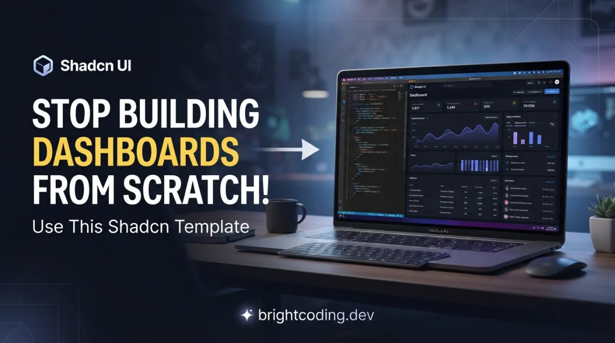
What if I told you that thousands of developers are wasting 40+ hours on something that takes 5 minutes? Here's the painful truth: every time you start a new admin panel, SaaS dashboard, or internal tool, you're rebuilding the same authentication flows, sidebar layouts, data tables, and dark mode toggles. Again. And again. And again.
Sound familiar? You've been there. Stuck in CSS grid hell at 2 AM. Fighting with Tailwind configuration. Wrestling with React↗ Bright Coding Blog state management for theme switching. Meanwhile, your actual product features sit untouched in the backlog, gathering dust like that gym membership you swore you'd use.
But what if there was a secret weapon that top-tier developers are already using to ship production-ready dashboards in hours, not weeks? Enter the shadcn-dashboard-landing-template — a breathtakingly complete, open-source admin dashboard and landing page template that's making waves across the React ecosystem. Built by ShadcnStore, this isn't some half-baked starter kit. It's a battle-tested, fully customizable, production-ready powerhouse with dual framework support, live theme customization, and 30+ pre-built pages that will make your inner developer weep with joy.
Ready to stop reinventing the wheel and start shipping? Let's dive deep into why this template is about to become your new obsession.
What Is the Shadcn Dashboard + Landing Page Template?
The shadcn-dashboard-landing-template is a sleek, modern, and completely free open-source template engineered by ShadcnStore — a rising force in the premium UI components space. At its core, this project delivers two complete templates in one: a feature-rich admin dashboard and a business-ready marketing landing page, each available in both Vite + React and Next.js↗ Bright Coding Blog 15 flavors.
What makes this template genuinely special isn't just the sheer volume of included components (though 30+ pages is impressive). It's the architectural decisions baked into every line of code. This isn't a fragile collection of copy-pasted components held together with hope and console.log statements. It's built on shadcn/ui v3 — the gold standard for accessible, composable React components — powered by Radix UI primitives, styled with Tailwind CSS↗ Bright Coding Blog v4, and wrapped in full TypeScript type safety from root to leaf.
The template exploded in popularity for one simple reason: it solves the "blank canvas paralysis" that strikes every developer starting a new project. Instead of staring at an empty src folder wondering whether to use App Router or Pages Router, CSS Modules or Tailwind, Zustand or Redux — you clone, install, and start building your actual product immediately.
ShadcnStore developed this as a gateway drug to their broader ecosystem of premium blocks and templates. The strategy is brilliant: give developers an irresistible taste of quality, then let them discover the deeper value of their paid offerings. But make no mistake — this free template stands entirely on its own merits, with no artificial limitations, paywalls, or "upgrade to unlock" dark patterns.
Key Features That Will Blow Your Mind
Let's dissect what makes this template a technical masterpiece worth your attention:
Dual Framework Architecture
Most templates force you into a single ecosystem. This one refuses to choose for you. The repository contains two fully maintained versions:
- Vite + React 19: Lightning-fast HMR, minimal configuration, pure development bliss for SPAs and embedded dashboards
- Next.js 15 with App Router: Server components, streaming, SEO↗ Bright Coding Blog optimization, and production scalability for serious applications
Both versions share identical component APIs and styling, so switching between them is painless if your requirements evolve.
Live Theme Customization Engine
The built-in theme customizer (powered by tweakcn integration) is where this template transcends ordinary starters. You get:
- Real-time color switching across 7 preset palettes: Default, Dark, Rose, Green, Orange, Red, and Violet
- Layout morphing between sidebar variants and collapsible navigation modes
- Instant preview of every possible combination without page reloads
- Exportable custom themes via CSS variable configuration in oklch color space
This isn't just dark mode toggle. It's professional design system management accessible from a floating UI panel.
Complete Application Ecosystem
Beyond static pages, you get functional application demos that demonstrate real-world patterns:
- Mail client with inbox, read, and compose interfaces
- Task manager featuring drag-and-drop interactions
- Chat application with real-time messaging UI
- Calendar with event scheduling visuals
- User management powered by TanStack Table with sorting, filtering, and pagination
Each app demonstrates state management patterns, data fetching strategies, and complex UI interactions you can study and adapt.
Developer Experience Obsession
The maintainers clearly eat their own dog food:
- Full TypeScript coverage — no
anytypes lurking in shadows - Zustand for lightweight, performant state management
- React Hook Form + Zod for bulletproof form validation
- Recharts for composable, responsive data visualizations
- Container queries for truly responsive component behavior
- ESLint + Prettier configurations that actually make sense
Real-World Use Cases Where This Template Dominates
1. SaaS Admin Panels
Building a B2B software product? You need user management, subscription billing views, analytics dashboards, and team settings — all included, all interconnected. The template's settings pages cover account, appearance, billing, notifications, and social connections. Your pricing page is already built with three variants. Deploy on Monday, onboard customers by Friday.
2. AI/ML Product Interfaces
Modern AI tools demand sophisticated dashboards for prompt management, usage analytics, and model configuration. The analytics dashboard variant with Recharts integration provides the visualization foundation. The chat app demo maps perfectly to conversational AI interfaces. The dark mode-first design ethos aligns with developer-heavy AI tool audiences.
3. Internal Tools & Operations Dashboards
Every engineering team eventually builds internal tooling for deployment monitoring, customer support, or content moderation. This template's data tables with TanStack Table handle massive datasets gracefully. The authentication system supports multiple login flows. The modular component structure means you add only what you need, removing bloat.
4. Marketing Sites with Product Dashboards
The included landing page template isn't an afterthought — it's a complete 12-section marketing site with hero, features, testimonials, pricing, FAQ, and contact components. Perfect for products that need public marketing pages and authenticated dashboard experiences. The theme customizer ensures brand consistency across both surfaces.
Step-by-Step Installation & Setup Guide
Prerequisites
Ensure your environment meets these requirements:
- Node.js 18+ (check with
node --version) - pnpm strongly recommended for deterministic installs
Install pnpm if needed:
npm install -g pnpm
Clone and Navigate
# Clone the repository
git clone https://github.com/silicondeck/shadcn-dashboard-landing-template
cd shadcn-dashboard
Vite Version Setup (Recommended for Rapid Development)
# Enter Vite directory
cd vite-version

# Install dependencies with pnpm
pnpm install

# Start development server
pnpm dev
Your dashboard spins up at http://localhost:5173 with HMR so fast you'll think it's broken.
Next.js Version Setup (Production Deployment)
# Enter Next.js directory
cd nextjs-version

# Install dependencies
pnpm install

# Start development with App Router
pnpm dev
Access at http://localhost:3000 with full server component support and API route capabilities.
Production Build Verification
Vite:
pnpm build      # Outputs to dist/ with optimized assets
pnpm preview    # Verify production build locally
Next.js:
pnpm build      # Static export or server build
pnpm start      # Production server simulation
Post-Installation Exploration Path
Once running, systematically explore:
/dashboard— Primary analytics overview with chart cards/dashboard-2— Alternative layout with different metric emphasis/landing— Complete marketing page template/mail,/tasks,/chat,/calendar— Functional app demonstrations/auth/sign-in— Three authentication layout variants/settings/account— User preference management patterns
REAL Code Examples from the Repository
Let's examine actual implementation patterns from this template, extracted directly from the README and project structure.
Example 1: Custom Theme Configuration
The template's theming system uses oklch color space for perceptually uniform color manipulation. Here's how custom themes are defined:
// src/config/theme-data.ts
export const customTheme = {
  name: "Custom Brand",
  cssVars: {
    light: {
      // oklch(lightness chroma hue) format for superior color interpolation
      primary: "210 100% 50%",           // Brand primary: vivid blue
      "primary-foreground": "0 0% 98%",  // Near-white text on primary
      secondary: "210 100% 95%",         // Muted blue for secondary elements
      "secondary-foreground": "210 100% 20%", // Dark text for contrast
      accent: "210 100% 90%",            // Highlight accents
      "accent-foreground": "210 100% 15%",    // Text on accent backgrounds
      // Extend with additional semantic color tokens as needed
    },
    dark: {
      // Dark mode inverts lightness while preserving hue family
      primary: "210 100% 60%",           // Brighter primary for dark backgrounds
      "primary-foreground": "210 100% 15%",   // Dark text for light primary
      // Additional dark mode variants maintain visual hierarchy
    }
  }
}
Why this matters: The oklch color space prevents the muddy, inconsistent color shifts that plague HSL-based theming. When you programmatically generate tints and shades, oklch maintains perceptual uniformity — your brand colors look intentional, not accidental.
Example 2: Manual CSS Variable Customization
For direct control without the customizer abstraction, modify global styles:
/* globals.css or index.css */
:root {
  /* Base theme using oklch for modern color management */
  --primary: oklch(0.5 0.2 240);           /* Mid-tone blue with moderate chroma */
  --primary-foreground: oklch(0.98 0.02 240); /* Nearly white, slight blue tint */
  --secondary: oklch(0.96 0.01 240);       /* Very light desaturated blue */
  --secondary-foreground: oklch(0.2 0.02 240); /* Dark with subtle hue */
  /* Additional semantic tokens follow same pattern */
}

.dark {
  /* Dark mode shifts lightness curve upward for visibility */
  --primary: oklch(0.7 0.2 240);           /* Lighter primary pops on dark bg */
  --primary-foreground: oklch(0.15 0.02 240); /* Near-black for contrast */
  /* Systematic dark mode adaptation preserves brand identity */
}
Implementation insight: The template uses CSS custom properties at the :root level, enabling runtime theme switching without JavaScript↗ Bright Coding Blog re-renders. The dark class toggle propagates changes instantly across all components consuming these variables.
Example 3: Next.js App Router Structure
The Next.js version demonstrates route group organization for clean URL patterns without folder pollution:
// File: src/app/(dashboard)/layout.tsx
// Route group (dashboard) excludes parentheses from URL path
// Enables shared layouts for logically grouped routes

export default function DashboardLayout({
  children,
}: {
  children: React.ReactNode
}) {
  return (
    <div className="flex min-h-screen">
      {/* Persistent sidebar across all dashboard routes */}
      <Sidebar variant="inset" collapsible="icon" />

      <main className="flex-1 overflow-y-auto">
        {/* Top navigation with breadcrumb and user actions */}
        <Header />

        {/* Route-specific content injected here */}
        <div className="container py-6">
          {children}
        </div>
      </main>

      {/* Floating theme customizer accessible globally */}
      <ThemeCustomizer />
    </div>
  )
}
Architectural brilliance: Route groups (auth) and (dashboard) create layout boundaries without affecting URLs. Authentication pages share minimal chrome (no sidebar), while dashboard routes inherit full navigation. This pattern scales to complex application structures without route configuration sprawl.
Example 4: Vite Development Commands
The Vite version leverages modern build tooling for optimal DX:
# Start development with instant HMR
pnpm dev

# Production build with Rollup optimization
pnpm build

# Preview production build before deployment
pnpm preview

# Code quality enforcement
pnpm lint
Performance note: Vite's esbuild-powered dev server starts in sub-300ms for this template's component volume, versus 3-8 second Webpack cold starts. The preview command serves your production build locally, catching asset path and optimization issues before deployment.
Advanced Usage & Best Practices
Removing the Theme Customizer for Production
The floating customizer is invaluable during development but unnecessary in shipped products. Here's the surgical removal process:
Vite Version:
- Delete
src/components/theme-customizer.tsx - Remove customizer button from layout components
- Strip theme-related imports from main layout
- Delete
src/components/theme-customizer/directory
Next.js Version:
- Delete
src/components/theme-customizer.tsx - Remove from
src/app/layout.tsx - Clean layout file imports
- Remove directory if exists
State Management Scaling
The template uses Zustand for lightweight global state. For complex applications:
- Split stores by domain (authStore, uiStore, dataStore)
- Implement persist middleware for user preference hydration
- Use immer middleware for immutable state updates without spread syntax hell
Component Composition Patterns
Study the components/ui/ directory for shadcn/ui v3 composition techniques. The asChild pattern with Radix UI's Slot component enables polymorphic components that render as any HTML element or React component while preserving type safety.
Performance Optimization
- Leverage React 19's compiler for automatic memoization where configured
- Use Next.js Image component for optimized loading in the Next.js version
- Implement virtualization for data tables exceeding 100 rows
- Profile with React DevTools to identify unnecessary re-renders in dashboard widgets
Comparison with Alternatives
| Feature | Shadcn Template | Material-UI Dashboard | Ant Design Pro | Tremor |
|---|---|---|---|---|
| Framework Flexibility | Vite + Next.js | React only | React only | React only |
| Component Source | Open, customizable | Black-box library | Black-box library | Open, limited |
| Theme System | Live customizer + oklch | ThemeProvider object | Less variables | Tailwind-based |
| TypeScript | Full coverage | Partial | Good | Good |
| Landing Page | ✅ Included | ❌ Separate purchase | ❌ Separate | ❌ Dashboard only |
| Tailwind CSS | v4 native | Custom solution | Custom solution | v3 based |
| Bundle Size | Tree-shakeable | Heavy | Heavy | Moderate |
| Learning Curve | Low (standard patterns) | Medium | High | Low |
| Commercial License | MIT (free) | Proprietary | MIT | Apache 2.0 |
| App Router Support | ✅ Native | ❌ Pages only | ❌ Pages only | ❌ Pages only |
The verdict: If you need maximum flexibility, modern architecture, and zero vendor lock-in, this template dominates. Material-UI and Ant Design trap you in their ecosystem. Tremor is excellent for pure dashboards but lacks landing pages and framework choice. Only the shadcn template gives you true ownership of every line of code.
FAQ: Your Burning Questions Answered
Is the shadcn dashboard template really free for commercial use?
Absolutely. MIT licensed with zero restrictions. Use it in client projects, SaaS products, or internal tools. Attribution to ShadcnStore is appreciated but not legally required.
Can I use this with Next.js App Router and Server Components?
Yes — it's designed for it. The Next.js version uses App Router natively with route groups, streaming, and async server components. The Vite version is client-side rendered for embedded or standalone scenarios.
How do I customize colors beyond the preset themes?
Define custom cssVars objects in the theme configuration using oklch values, or directly modify globals.css variables. The live customizer provides immediate visual feedback for all changes.
Is React 19 stable enough for production?
The template uses React 19 with concurrent features. For conservative deployments, you can downgrade to React 18 — the component patterns are compatible, though you'll lose automatic memoization benefits.
What's the difference between shadcn/ui v3 and previous versions?
v3 introduces improved accessibility, better Tailwind v4 integration, enhanced theming with CSS variables, and refined component APIs. This template leverages all v3 improvements.
Can I remove pages I don't need?
Easily. The modular structure means deleting a route folder removes that feature. No hidden dependencies or global registrations to untangle.
How does this compare to building from scratch?
Conservatively, this template saves 60-80 hours of initial development: design system setup, component library selection, authentication flows, responsive layouts, dark mode implementation, and application scaffolding — all solved.
Conclusion: Your Dashboard Shortcut Is Here
The shadcn-dashboard-landing-template isn't just another starter — it's a declaration of war against repetitive dashboard development. Every hour you spend rebuilding authentication pages is an hour stolen from your product's unique value proposition. Every custom CSS battle is technical debt that compounds.
This template hands you production-grade architecture on a silver platter: dual framework support, live theming, 30+ pages, functional app demos, and the incomparable developer experience of React 19 + TypeScript + Tailwind CSS v4 + shadcn/ui v3. The MIT license means true freedom, not faux-open-source with hidden catches.
My honest assessment? Clone it today. Spend 30 minutes exploring the structure. You'll immediately recognize the thousands of decisions already made correctly — accessibility patterns, color contrast ratios, responsive breakpoints, state management boundaries, component composition techniques. Then customize ruthlessly for your brand, ship faster than competitors, and finally build what actually differentiates your product.
The era of dashboard scaffolding from scratch is over. The future belongs to developers who leverage exceptional foundations and focus their creativity where it matters.
👉 Star the repository on GitHub — and start building something extraordinary today.
Built with ❤️ by ShadcnStore. Explore their premium blocks and templates for even more acceleration.
Outils recommandés
Explore on the BrightCoding network
Hand-picked resources from our other sites.
Filerobot Image Editor: The Essential Tool Every Developer Needs
Filerobot Image Editor is a powerful, free, open-source library that integrates professional image editing into web applications. Learn installation, advanced u...
Web Flight Simulator: The Browser Aviation Tool
Web Flight Simulator delivers high-fidelity aerial combat in your browser using Three.js and CesiumJS. Explore real-world terrain, master F-15 weapons systems,...
Stop Building Boring 3D Demos! This Solar System Repo Changes Everything
Discover Solar-System-3D, a production-ready THREE.js simulation with bloom effects, procedural asteroid belts, custom shaders, and interactive controls. Clone...
Continuez votre lecture
The Generative UI Revolution: How Tambo AI is Transforming React Development Forever
Build Stunning 3D Maps with Three.js: The Ultimate 2026 Developer Guide
Run a Powerful DeFi Trading Bot from a Single HTML File

Stop Coding Alone: OPC-Skills Gives Your AI Agent Superpowers
Commentaires 0
Aucun commentaire pour l'instant. Soyez le premier à réagir !