Why Top Teams Secretly Ditch Custom UI for Ant Design
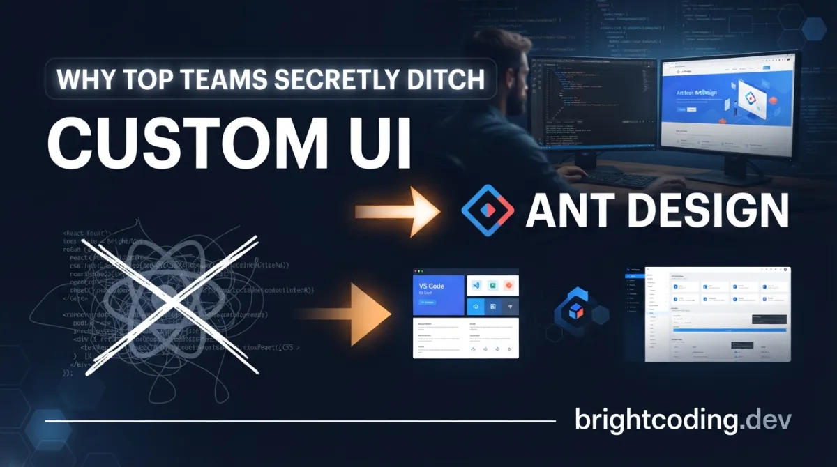
What if I told you that your custom-built component library is bleeding your team 20+ hours every sprint? That the "perfect" design system you crafted from scratch is actually a maintenance nightmare waiting to explode?
Here's the brutal truth most frontend architects won't admit: reinventing UI components is the fastest way to kill developer velocity. Every button, every date picker, every modal you build yourself carries hidden costs—accessibility debt, cross-browser bugs, design inconsistency, and the endless churn of keeping up with React↗ Bright Coding Blog's evolution.
But what if there was a battle-tested escape hatch? A library forged inside one of the world's largest fintech companies, battle-hardened by millions of users, and trusted by giants like Alibaba, Tencent, and Baidu?
Enter Ant Design—the enterprise-class React UI library that top engineering teams are quietly adopting to reclaim their sanity. With over 90,000 GitHub stars, millions of weekly npm downloads, and a thriving ecosystem that spans mobile, charts, and even Web3, Ant Design isn't just another component library. It's a complete design language that lets you ship polished, accessible, and consistent interfaces at ludicrous speed.
Stop burning cycles on solved problems. Let's expose why Ant Design has become the secret weapon behind the world's most demanding web applications—and how you can wield it today.
What Is Ant Design?
Ant Design (commonly abbreviated as "antd") is an enterprise-class UI design language and React component library originally developed by Ant Group—the fintech powerhouse behind Alipay, one of the world's largest mobile payment platforms. Born from the crucible of building complex financial dashboards, data-heavy admin panels, and mission-critical B2B applications, Ant Design distills years of real-world UX research into a cohesive, production-ready system.
The project lives at github.com/ant-design/ant-design and has evolved far beyond its origins. What started as an internal tool for Alibaba's ecosystem has blossomed into an open-source juggernaut under the Linux Foundation's umbrella, with active contributors spanning the globe. The repository's commit history reads like a masterclass in sustained open-source excellence—consistent releases, rigorous CI/CD pipelines, and a community that actually responds to issues.
But here's what makes Ant Design genuinely different from the flood of React UI libraries flooding npm weekly: it's not just components—it's a philosophy. The "design language" aspect means every button, table, and form follows rigorously researched interaction patterns. The spacing, the color psychology, the micro-interactions—they're all calibrated for cognitive efficiency in data-dense environments. When your users stare at dashboards for eight hours straight, these details compound into measurable productivity gains.
The timing couldn't be better. As enterprises accelerate digital transformation, the gap between "prototype" and "production-grade" widens dangerously. Ant Design bridges that chasm, offering TypeScript-first components with predictable static types, comprehensive internationalization for global deployments, and theming capabilities that don't require wrestling with CSS variables or !important hacks. It's trending now because the industry has finally recognized that design systems are infrastructure—and infrastructure deserves enterprise-grade investment.
Key Features That Separate Ant Design from the Pack
Let's dissect what makes Ant Design the weapon of choice for teams who can't afford to ship broken UIs.
🌈 Enterprise-Class UI Architecture
Every component is engineered for information density and task efficiency. Unlike consumer-focused libraries that prioritize aesthetic minimalism, Ant Design optimizes for professional workflows: complex forms with 50+ fields, nested data tables with sorting/filtering/grouping, multi-step wizards with validation state management. The visual hierarchy uses scientifically calibrated color contrasts and spacing scales that reduce eye strain during prolonged use.
📦 High-Quality React Components Out of the Box
With 60+ production-ready components covering every conceivable UI pattern—from basic buttons and inputs to advanced data visualization containers like Calendar, Timeline, and Statistic—Ant Design eliminates the "build vs. buy" debate entirely. Each component ships with complete accessibility support (ARIA labels, keyboard navigation, screen reader optimization), responsive behavior, and dark mode compatibility baked in.
🛡 TypeScript-First with Predictable Static Types
No more any types creeping into your codebase. Ant Design's entire API surface is strictly typed, providing IntelliSense documentation, compile-time error catching, and refactoring confidence that pure JavaScript↗ Bright Coding Blog libraries simply cannot match. The type definitions are co-authored with the components, not bolted on as an afterthought.
⚙️ Complete Design Resource Ecosystem
Beyond code, Ant Design provides Figma/Sketch design kits, Axure libraries, and icon systems that keep designers and developers in perfect sync. The "whole package" philosophy means your design-to-development handoff becomes frictionless—what's in the mockup is what ships, pixel-perfect.
🌍 Internationalization for Dozens of Languages
Built-in i18n support covers 40+ locales with automatic date formatting, number localization, RTL layout support, and culturally appropriate default text. Deploying to Japan? Brazil? Saudi Arabia? One configuration change, zero component rewrites.
🎨 Powerful CSS-in-JS Theming
Ant Design v5's Design Token system revolutionizes customization. Instead of overriding CSS classes or maintaining forked stylesheets, you modify semantic tokens—colorPrimary, borderRadius, fontSize—that cascade consistently across all components. The runtime theming engine supports dynamic switching without page reloads, enabling features like user-preference dark mode or brand-white-label applications.
Real-World Use Cases Where Ant Design Dominates
1. Enterprise Admin Dashboards
Picture a logistics company tracking 10,000+ shipments globally. They need filterable data tables, real-time status badges, batch operation toolbars, and export workflows—all accessible to non-technical operators. Ant Design's Table component with built-in pagination, sorting, and row selection handles this complexity without custom code. The Result and Empty states guide users through error scenarios gracefully.
2. Financial Services Applications
Banking interfaces demand bulletproof form validation, secure input masking, audit trails, and compliance-ready accessibility. Ant Design's Form component with declarative validation rules, InputNumber with precision controls, and DatePicker with disabled-date logic eliminate entire categories of financial UX bugs. The Descriptions component presents read-only account details with perfect semantic structure.
3. SaaS Multi-Tenant Platforms
When your product serves 500+ clients each demanding white-labeled branding, Ant Design's Design Token system becomes transformative. Each tenant gets their primary color, typography scale, and border personality—injected at runtime without rebuilding. The ConfigProvider component wraps your entire app, making theme switching as simple as passing a new token object.
4. Developer Tools and Internal Platforms
GitHub, Vercel, and Linear proved that developer experience is competitive advantage. Ant Design's Tabs with draggable panes, Tree for file exploration, Splitter for resizable panels, and CodeEditor integration patterns let you build sophisticated IDEs and debugging tools without reinventing window management. The Badge and Notification systems keep users informed of background processes.
5. Cross-Platform Electron Applications
Ant Design explicitly supports Electron environments, making it ideal for desktop applications that need native-feeling UI with web technology stacks. The component rendering adapts to Chromium's capabilities, and the theming system respects OS-level dark mode preferences automatically.
Step-by-Step Installation & Setup Guide
Getting Ant Design running takes under 60 seconds. Here's every path, from rapid prototyping to production optimization.
Standard Installation
Choose your package manager—Ant Design supports them all:
# npm
npm install antd

# Yarn
yarn add antd

# pnpm (fastest, disk-space efficient)
pnpm add antd

# Bun (cutting-edge speed)
bun add antd
Basic Project Setup
Create a new React project if needed, then import and use:
# If starting fresh with Vite (recommended)
npm create vite@latest my-antd-app -- --template react-ts
cd my-antd-app
npm install
npm install antd
npm run dev
Minimal Working Configuration
In your main entry file, wrap your application with ConfigProvider for theme control:
// main.tsx
import React from 'react';
import ReactDOM from 'react-dom/client';
import { ConfigProvider } from 'antd';
import App from './App';

ReactDOM.createRoot(document.getElementById('root')!).render(
  <React.StrictMode>
    {/* ConfigProvider enables global theme and locale configuration */}
    <ConfigProvider
      theme={{
        token: {
          colorPrimary: '#1890ff', // Your brand color
          borderRadius: 6,
        },
      }}
    >
      <App />
    </ConfigProvider>
  </React.StrictMode>
);
Development Environment (For Contributors)
Want to hack on Ant Design itself? The project provides a zero-install online environment via opensumi.run, or clone locally:
# Clone the repository
git clone git@github.com:ant-design/ant-design.git
cd ant-design

# Install dependencies
npm install

# Start the development server
npm start

# Browser opens at http://127.0.0.1:8001 with hot reload
The local dev server includes interactive component playgrounds, documentation previews, and visual regression testing tools.
Production Optimization
For production builds, enable tree-shaking and on-demand loading:
# Install babel plugin for automatic import optimization
npm install babel-plugin-import --save-dev
Configure your bundler to import only used components, slashing bundle sizes by 60-80%.
REAL Code Examples from the Repository
Let's examine actual code patterns from Ant Design's official documentation, dissecting why they work and how to extend them.
Example 1: Basic Component Usage
The README's canonical example demonstrates Ant Design's zero-ceremony approach:
import { Button, DatePicker } from 'antd';

export default () => (
  <>
    {/* Primary buttons use your theme's colorPrimary token */}
    <Button type="primary">PRESS ME</Button>
    {/* DatePicker automatically handles locale, formatting, and accessibility */}
    <DatePicker placeholder="select date" />
  </>
);
Why this matters: Two lines of imports, zero configuration, and you get fully accessible, themed, and localized components. The type="primary" prop isn't just stylistic—it triggers the design system's semantic color hierarchy, ensuring consistent visual weight across your application. The DatePicker automatically inherits your ConfigProvider's locale setting, displaying month names and date formats correctly for Japanese, German, or Arabic users without prop drilling.
Example 2: Production-Ready Form with Validation
Building on the basic patterns, here's how Ant Design handles complex form workflows:
import { Form, Input, Button, message } from 'antd';
import type { FormProps } from 'antd';

// Define your form data shape with TypeScript
type FieldType = {
  username?: string;
  email?: string;
  password?: string;
};

const onFinish: FormProps<FieldType>['onFinish'] = (values) => {
  // Type-safe values object—no guessing field names
  console.log('Success:', values);
  message.success('Registration successful!');
};

const onFinishFailed: FormProps<FieldType>['onFinishFailed'] = (errorInfo) => {
  console.log('Failed:', errorInfo);
  message.error('Please correct the errors below.');
};

export default () => (
  <Form
    name="registration"
    labelCol={{ span: 8 }}
    wrapperCol={{ span: 16 }}
    style={{ maxWidth: 600 }}
    initialValues={{ remember: true }}
    onFinish={onFinish}
    onFinishFailed={onFinishFailed}
    autoComplete="off"
  >
    <Form.Item<FieldType>
      label="Username"
      name="username"
      // Declarative validation rules—no custom handler needed
      rules={[
        { required: true, message: 'Username is required!' },
        { min: 3, message: 'Minimum 3 characters' },
        { pattern: /^[a-zA-Z0-9_]+$/, message: 'Alphanumeric only' },
      ]}
    >
      <Input />
    </Form.Item>

    <Form.Item<FieldType>
      label="Email"
      name="email"
      rules={[
        { required: true, message: 'Email is required!' },
        { type: 'email', message: 'Valid email only!' },
      ]}
    >
      <Input />
    </Form.Item>

    <Form.Item<FieldType>
      label="Password"
      name="password"
      rules={[{ required: true, message: 'Password is required!' }]}
    >
      <Input.Password />
    </Form.Item>

    <Form.Item wrapperCol={{ offset: 8, span: 16 }}>
      <Button type="primary" htmlType="submit">
        Register
      </Button>
    </Form.Item>
  </Form>
);
The power here: Notice how validation logic lives declaratively in rules arrays, not imperative event handlers. This pattern eliminates an entire class of bugs where validation state drifts from UI state. The Form.Item wrapper automatically handles error message positioning, ARIA attributes for screen readers, and visual error states. The onFinish callback only fires when all validations pass—no manual checking required.
Example 3: Dynamic Theming with Design Tokens
Ant Design v5's theming system enables runtime customization impossible with traditional CSS approaches:
import { useState } from 'react';
import { ConfigProvider, Button, Space, ColorPicker } from 'antd';
import type { ThemeConfig } from 'antd';

export default () => {
  // State-managed theme for dynamic switching
  const [primaryColor, setPrimaryColor] = useState('#1890ff');

  const theme: ThemeConfig = {
    token: {
      colorPrimary: primaryColor,
      borderRadius: 8,
      // Derived tokens automatically adjust for contrast
      colorPrimaryBg: primaryColor, // Background tints
      colorPrimaryBorder: primaryColor, // Border variations
    },
    components: {
      Button: {
        // Component-specific overrides
        controlHeight: 40,
        paddingContentHorizontal: 24,
      },
    },
  };

  return (
    <ConfigProvider theme={theme}>
      <Space direction="vertical" size="large">
        <ColorPicker
          value={primaryColor}
          onChange={(color) => setPrimaryColor(color.toHexString())}
          showText
        />
        <Button type="primary">Dynamic Theme Button</Button>
        <Button>Default Button (inherits neutral tokens)</Button>
      </Space>
    </ConfigProvider>
  );
};
Why this is revolutionary: Traditional theming requires rebuilding CSS, managing CSS variables, or maintaining parallel stylesheets. Ant Design's CSS-in-JS engine computes all derivative colors (hover states, active states, disabled opacity) mathematically from your base tokens. Change colorPrimary to #ff4d4f, and every component using that token updates instantly—no page reload, no style tag manipulation. The components key enables surgical overrides without affecting global design language.
Example 4: Data Table with Complex Operations
Enterprise applications live and die by data presentation. Here's Ant Design's Table handling server-side pagination, filtering, and row selection:
import { useState } from 'react';
import { Table, Tag, Space } from 'antd';
import type { TableProps } from 'antd';

interface DataType {
  key: string;
  name: string;
  age: number;
  address: string;
  tags: string[];
  status: 'active' | 'inactive' | 'pending';
}

const columns: TableProps<DataType>['columns'] = [
  {
    title: 'Name',
    dataIndex: 'name',
    key: 'name',
    // Built-in sort and filter UI
    sorter: (a, b) => a.name.localeCompare(b.name),
    filters: [
      { text: 'Joe', value: 'Joe' },
      { text: 'Jim', value: 'Jim' },
    ],
    onFilter: (value, record) => record.name.includes(value as string),
  },
  {
    title: 'Status',
    dataIndex: 'status',
    key: 'status',
    render: (status) => (
      <Tag color={status === 'active' ? 'green' : status === 'pending' ? 'gold' : 'red'}>
        {status.toUpperCase()}
      </Tag>
    ),
  },
  {
    title: 'Tags',
    key: 'tags',
    dataIndex: 'tags',
    render: (tags: string[]) => (
      <>
        {tags.map((tag) => (
          <Tag color="blue" key={tag}>
            {tag}
          </Tag>
        ))}
      </>
    ),
  },
  {
    title: 'Action',
    key: 'action',
    render: (_, record) => (
      <Space size="middle">
        <a>Invite {record.name}</a>
        <a>Delete</a>
      </Space>
    ),
  },
];

export default () => {
  const [selectedRows, setSelectedRows] = useState<DataType[]>([]);

  const rowSelection: TableProps<DataType>['rowSelection'] = {
    onChange: (selectedRowKeys, selectedRows) => {
      setSelectedRows(selectedRows);
      console.log(`Selected ${selectedRowKeys.length} rows`);
    },
    // Preserve selection across pagination
    preserveSelectedRowKeys: true,
  };

  return (
    <>
      <div style={{ marginBottom: 16 }}>
        Selected: {selectedRows.length} rows
      </div>
      <Table
        rowSelection={rowSelection}
        columns={columns}
        dataSource={/* your data */}
        pagination={{
          total: 1000,
          pageSize: 10,
          showSizeChanger: true,
          showQuickJumper: true,
        }}
        // Virtual scroll for massive datasets
        scroll={{ y: 400 }}
      />
    </>
  );
};
Enterprise patterns unlocked: The rowSelection with preserveSelectedRowKeys solves the "lost selection on page change" bug that plagues naive table implementations. Built-in sorter and filters eliminate custom state management for common operations. The scroll prop enables virtualized rendering—critical when displaying 10,000+ rows without DOM choking. The render pattern for custom cell content is type-safe and composable.
Advanced Usage & Best Practices
Optimize Bundle Size with On-Demand Loading
Never import the entire library. Use babel-plugin-import or Vite's vite-plugin-style-import to automatically transform:
import { Button } from 'antd';
// Into: import Button from 'antd/es/button';
// Plus: import 'antd/es/button/style';
This reduces production bundles from 800KB+ to under 200KB gzipped.
Leverage ConfigProvider Hierarchy
Nest ConfigProvider components for scoped theming—different sections of your app can have distinct personalities without prop drilling:
<ConfigProvider theme={globalTheme}>
  <AppHeader />
  <ConfigProvider theme={dashboardTheme}>
    <Dashboard /> {/* Different primary color, spacing */}
  </ConfigProvider>
</ConfigProvider>
Master the useToken Hook
Access design tokens programmatically for custom components that feel native:
import { theme } from 'antd';

const { useToken } = theme;

const CustomComponent = () => {
  const { token } = useToken(); // Access colorPrimary, fontSize, etc.
  return <div style={{ color: token.colorPrimary }}>Themed!</div>;
};
Server-Side Rendering (SSR) Optimization
Ant Design fully supports Next.js↗ Bright Coding Blog and Remix. Use @ant-design/cssinjs's StyleProvider with ssr prop to extract critical CSS, preventing flash of unstyled content:
import { StyleProvider, createCache, extractStyle } from '@ant-design/cssinjs';

const cache = createCache();
// In your server render:
const styleText = extractStyle(cache);
// Inject into <head> for instant first paint
Comparison with Alternatives
| Feature | Ant Design | Material UI | Chakra UI | Bootstrap React |
|---|---|---|---|---|
| Design Philosophy | Enterprise/B2B density | Material Design | Minimal/Composable | General purpose |
| Component Count | 60+ | 50+ | 40+ | 25+ |
| TypeScript | Native, strict | Good | Excellent | Partial |
| Theming Engine | Design Tokens (runtime) | ThemeProvider | Style props | Sass variables |
| Bundle Size (min) | ~300KB (tree-shaken) | ~300KB | ~250KB | ~200KB |
| Enterprise Patterns | Built-in (tables, forms) | Add-ons needed | Manual composition | Limited |
| i18n Support | 40+ locales | 30+ locales | Community | Community |
| Design Resources | Figma, Sketch, Axure | Figma | Figma | Limited |
| Ecosystem | Charts, Mobile, Pro, Web3 | X (experimental) | Chakra Pro | Minimal |
| Corporate Backing | Ant Group / Linux Foundation | MUI (startup) | Independent | OpenJS |
Why Ant Design wins for serious applications: The ecosystem depth is unmatched. When your project needs charts, you don't hunt for a compatible library—@ant-design/charts exists. When you need a complete admin scaffold, Ant Design Pro provides production-ready layouts with routing, authentication, and internationalization wired. The enterprise patterns are native, not community plugins that break between versions.
FAQ
Is Ant Design free for commercial use?
Yes. Ant Design is MIT licensed. You can use it in commercial products, modify it, and even redistribute it without disclosing your source code. The Linux Foundation governance ensures it stays open and independent.
How does Ant Design compare to Tailwind for styling?
They're complementary, not competitive. Tailwind is a utility CSS framework; Ant Design is a component library with built-in design decisions. Many teams use Tailwind for custom marketing pages and Ant Design for application interfaces. Ant Design v5's CSS-in-JS engine actually works alongside Tailwind without conflicts.
Can I use Ant Design with Next.js App Router?
Absolutely. Ant Design supports React Server Components through careful 'use client' directives. Use the @ant-design/nextjs-registry package for seamless App Router integration with automatic style extraction.
Is Ant Design accessible (a11y)?
Yes, by default. All components ship with ARIA attributes, keyboard navigation, and focus management. The team maintains WCAG 2.1 AA compliance as a core requirement, not an afterthought. Screen reader testing is part of the CI pipeline.
How do I migrate from Ant Design v4 to v5?
The team provides a codemod CLI that automates 90% of migrations. The v5 upgrade primarily involves moving from Less variables to Design Tokens. Most component APIs remain unchanged. Detailed migration guide: ant.design/docs/react/migration-v5.
Does Ant Design work with React 18+ concurrent features?
Fully supported. Ant Design v5 was engineered alongside React 18's development, with proper useId usage, concurrent-safe state updates, and Suspense-compatible loading patterns.
What if I need components Ant Design doesn't have?
The Ant Design ecosystem extends through @ant-design/pro-components (advanced business components), Ant Design X (AI interfaces), and the underlying rc-components library for headless primitives. The community also maintains excellent third-party integrations.
Conclusion
Here's my honest assessment after years of building with Ant Design: it's not perfect, but it's the closest thing to a complete frontend operating system we have. The learning curve is steeper than tossing together Tailwind utilities, and the design language imposes opinions that may chafe if you want whimsical, consumer-app aesthetics. But for applications where users accomplish work—where efficiency, consistency, and reliability trump novelty—Ant Design is simply in a different league.
The 90,000+ GitHub stars aren't hype. They're a vote of confidence from engineers who've shipped with this library at scale, who've debugged 3 AM production issues, who've onboarded teams of twenty. The enterprise patterns are battle-tested by some of the world's highest-traffic applications.
Stop reinventing buttons. Stop maintaining that custom component library that your team secretly dreads. The time you save isn't just hours—it's cognitive bandwidth you can redirect toward solving problems that actually differentiate your product.
Star Ant Design on GitHub, install it in your next project, and experience what it feels like to ship with confidence. Your future self—and your team—will thank you.
Ready to dive deeper? Explore the official documentation, experiment in the online playground, or join the active Discord community for real-time support.
Outils recommandés
Explore on the BrightCoding network
Hand-picked resources from our other sites.
navorite/sessionic: Cross-Browser Session Management for Developers
navorite/sessionic is an open-source browser extension built in TypeScript for saving, managing and restoring sessions, windows and tabs across Firefox, Chrome,...
EvilCharts: Why Developers Are Ditching Boring Charts for This
EvilCharts combines shadcn/ui's design system with Recharts' power to deliver stunning animated visualizations for React and Next.js. Learn installation, real c...
Stop Building Dashboards from Scratch! Use This Shadcn Template
Discover the free shadcn-dashboard-landing-template: a production-ready React & Next.js admin dashboard with 30+ pages, live theming, dual framework support, an...
Continuez votre lecture
avvvatars: The Revolutionary Avatar Tool React Developers Need
3D Infinite Carousel: Why Developers Are Ditching Swiper.js for This
Home Assistant Frontend: The Smart Home UI Revolution

Stop Coding Alone: OPC-Skills Gives Your AI Agent Superpowers
Commentaires 0
Aucun commentaire pour l'instant. Soyez le premier à réagir !