mwaskom/seaborn: Statistical Visualization for Pandas Workflows
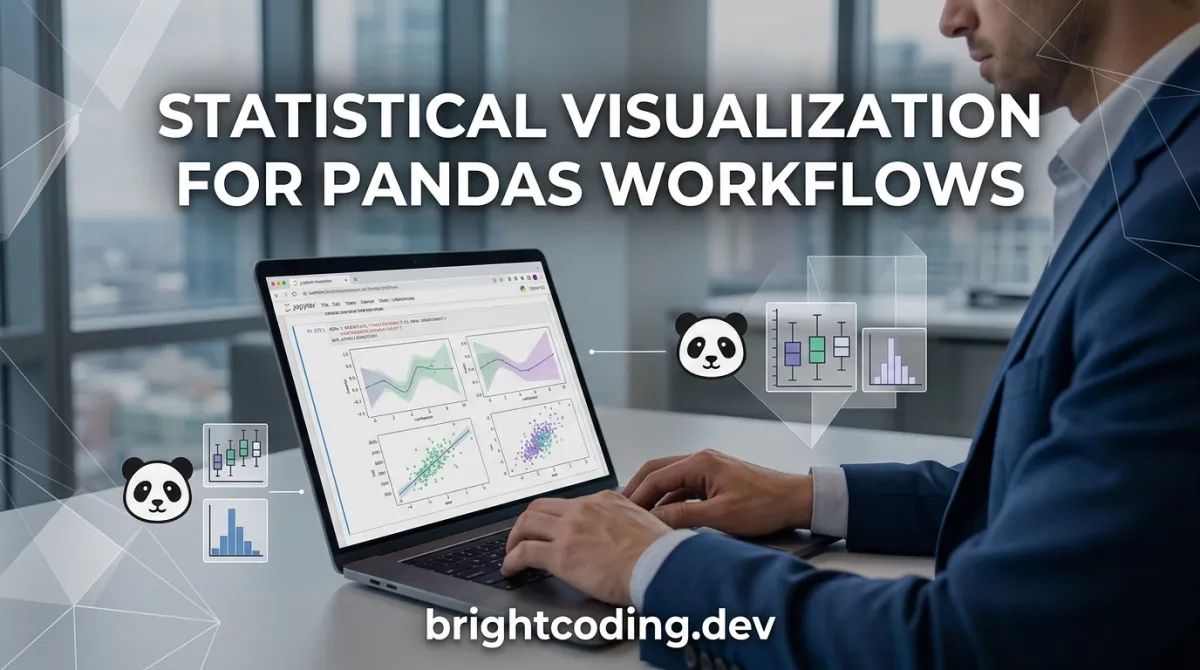
Data exploration in Python↗ Bright Coding Blog often hits a friction point: you've cleaned your data with Pandas, but producing publication-quality statistical graphics requires verbose matplotlib boilerplate. Developers and researchers waste cycles tweaking colors, legends, and statistical overlays instead of analyzing results. mwaskom/seaborn addresses this directly—it's a Python visualization library built on matplotlib that provides a high-level interface for drawing attractive statistical graphics, with native integration for Pandas DataFrames.
The tweet framing captures the core value proposition: seaborn bridges the gap between data manipulation and visual communication. For teams working in scientific Python, machine learning, or analytics pipelines, this translates to faster iteration and more consistent output without sacrificing customization depth when needed.
What is mwaskom/seaborn?
mwaskom/seaborn is a statistical data visualization library for Python, maintained by Michael Waskom and developed openly on GitHub. As of the latest commit on 2026-07-06, the repository has accumulated 13,960 stars and 2,127 forks, reflecting substantial adoption within the Python scientific computing ecosystem. The project is licensed under the BSD 3-Clause "New" or "Revised" License, a permissive license that allows commercial and academic use with minimal restrictions.
Seaborn occupies a specific niche in the Python visualization stack. It does not replace matplotlib—it builds upon it. This architectural decision matters: seaborn handles the statistical estimation and aesthetic defaults, then delegates rendering to matplotlib's proven engine. Users retain access to matplotlib's lower-level APIs for fine-grained control.
The library's relevance is tied to the dominance of Pandas in Python data manipulation and the continued demand for statistical graphics in fields from bioinformatics to social science. With Python 3.10+ support, seaborn tracks modern Python versions without legacy baggage. The project also carries formal academic credibility: a descriptive paper was published in the Journal of Open Source Software (JOSS), providing a citable reference for researchers.
Key Features
Pandas-native data handling. Seaborn functions accept Pandas DataFrames directly, using column names for variables rather than requiring explicit array extraction. This eliminates a common source of boilerplate and reduces the surface area for shape-mismatch bugs.
Statistical estimation built-in. Many plotting functions perform statistical aggregation automatically—computing means, confidence intervals, regression fits, or kernel density estimates without manual preprocessing. This shifts cognitive load from implementation to interpretation.
Matplotlib foundation with sensible defaults. Seaborn's default color palettes, font scaling, and layout parameters are designed for statistical graphics readability. The resulting figures require less post-processing for presentations or publications compared to raw matplotlib output.
Modular API structure. The library organizes functionality into distinct modules: relational plots (scatterplot, lineplot), distributional plots (histplot, kdeplot, ecdfplot), categorical plots (barplot, boxplot, violinplot), regression plots (regplot, lmplot), and matrix plots (heatmap, clustermap). This modularity helps users discover appropriate techniques for their data types.
Optional statistical dependencies. Core functionality requires only numpy, pandas, and matplotlib. Advanced statistical features—such as more sophisticated regression or distribution fitting—are available by installing optional scipy and statsmodels dependencies.
Comprehensive documentation ecosystem. The project maintains documentation at seaborn.pydata.org including tutorials, an example gallery, API reference, and FAQ. This resource depth supports both quick lookups and structured learning.
Use Cases
Exploratory data analysis in research workflows. Scientists loading experimental measurements into Pandas DataFrames can generate distribution comparisons, correlation matrices, and regression diagnostics with minimal code. The JOSS publication indicates seaborn is designed with this audience explicitly in mind.
Machine learning model evaluation. Practitioners can visualize feature distributions, class separations, residual patterns, and confusion matrices. The statistical estimation functions help communicate uncertainty in performance metrics—critical for robust model reporting.
Automated reporting pipelines. Seaborn's consistent output and matplotlib backend compatibility make it suitable for generating figures in scheduled jobs or CI/CD workflows. Figures can be saved to standard formats (PNG, PDF, SVG) for inclusion in automated reports.
Educational environments. The high-level API reduces the barrier to producing informative statistical graphics, making seaborn common in data science curricula. Students focus on analytical questions rather than graphics programming minutiae.
Production dashboard prototyping. While not a dashboard framework itself, seaborn enables rapid iteration on statistical visualizations that may later be reimplemented in interactive tools. The matplotlib foundation ensures portability of visualization logic.
Installation & Setup
Seaborn supports Python 3.10+. The core dependencies are numpy, pandas, and matplotlib.
Standard installation from PyPI:
uv pip install seaborn
This installs the latest stable release with required dependencies. The README explicitly recommends uv pip install as the modern Python packaging workflow.
With optional statistical dependencies:
uv pip install seaborn[stats]
This includes scipy and/or statsmodels for advanced statistical functionality.
Conda installation:
conda install seaborn
Note the README's caveat: the main anaconda repository typically lags PyPI for new releases. For faster updates, use conda-forge:
conda install -c conda-forge seaborn
Development setup (for contributors):
Clone the repository and run uv sync to install test dependencies. The project uses pytest for testing, ruff for linting, and pre-commit for automated style checks.
# After cloning
cd seaborn
uv sync
make test    # Run unit tests with coverage
make lint    # Check code style
For automated linting on commits:
pre-commit install
Real Code Examples
The README does not contain embedded code examples, which reflects the project's documentation strategy: comprehensive examples live in the online documentation at seaborn.pydata.org rather than the repository root. The following patterns are consistent with seaborn's documented API design and the tweet's emphasis on Pandas DataFrame integration.
Example 1: Basic statistical plot from a DataFrame
import seaborn as sns
import pandas as pd

# Assuming df is a Pandas DataFrame with 'x' and 'y' columns
# seaborn functions accept DataFrame and column name references directly
sns.scatterplot(data=df, x='x', y='y')
This demonstrates the core value: no manual array extraction, no figure/axis boilerplate for simple cases. The data parameter accepts the DataFrame; x and y are column name strings.
Example 2: Statistical estimation with categorical data
import seaborn as sns

# barplot computes mean and confidence interval automatically
sns.barplot(data=df, x='category', y='measurement')
The statistical aggregation happens internally—mean estimation with bootstrapped confidence intervals by default. This eliminates manual groupby and error bar calculation.
Example 3: Distribution visualization
import seaborn as sns

# histplot replaces the older distplot; handles both univariate and bivariate cases
sns.histplot(data=df, x='value', hue='group', kde=True)
The hue parameter maps a categorical column to color, with automatic legend generation. The kde=True overlay adds a kernel density estimate without separate function calls.
These examples reflect seaborn's design philosophy: statistical graphics through declarative, data-aware function calls. For more extensive examples, the [INTERNAL_LINK: python-data-visualization] documentation and seaborn.pydata.org gallery provide comprehensive references.
Advanced Usage & Best Practices
Leverage matplotlib for customization. Since seaborn returns matplotlib Axes objects, all standard matplotlib customization methods remain available. Use this for final figure tuning rather than fighting seaborn's abstractions.
Control figure-level vs. axes-level functions. Seaborn distinguishes between functions that create their own figure (relplot, catplot, lmplot, pairplot, jointplot) and those that draw on existing axes (scatterplot, lineplot, etc.). Mixing these incorrectly causes unexpected figure proliferation.
Manage color palettes explicitly. Seaborn provides sophisticated palette tools, but default choices may not suit colorblind readers or specific publication requirements. Review sns.color_palette() options and test output with accessibility tools.
Consider performance with large datasets. The statistical estimation functions can become computationally expensive with millions of rows. For exploratory work on large data, sampling or using datashader for initial rendering may be more efficient than raw seaborn—though this trade-off is not discussed in the README and reflects general visualization best practices.
Version-pin for reproducibility. The conda-forge lag mentioned in the README implies version consistency issues between environments. Pin seaborn and dependency versions in production or research contexts.
Comparison with Alternatives
| Tool | Relationship to seaborn | Key distinction |
|---|---|---|
| matplotlib | Foundation library | Lower-level, more verbose, full control; seaborn builds on it |
| Plotly | Alternative ecosystem | Interactive web-native output; steeper learning curve for statistical defaults |
| Altair | Alternative high-level API | Declarative grammar, Vega-Lite backend; less mature statistical estimation |
Seaborn's position is distinctive: it prioritizes statistical graphics with minimal code for Python data scientists already using Pandas, rather than interactivity (Plotly) or grammar-of-graphics purity (Altair). The matplotlib dependency is double-edged—proven rendering but static output by default.
FAQ
What Python versions does mwaskom/seaborn support? Python 3.10 and newer, per the README.
Is seaborn free for commercial use? Yes, under the BSD 3-Clause license.
Do I need to learn matplotlib first? Not required for basic usage, but matplotlib knowledge enables deeper customization.
Why install [stats] extras?
For scipy and statsmodels functionality used in advanced statistical plots.
How do I report bugs? Submit to the GitHub issue tracker with a reproducible example.
Where should I ask usage questions?
StackOverflow with the seaborn tag, per the README's guidance.
Is the JOSS paper required reading? No, but it provides a citable overview and introduction to key features.
Conclusion
mwaskom/seaborn serves a well-defined need in the Python data stack: statistical visualization with minimal friction for Pandas users. Its 13,960 stars and active maintenance through 2026 indicate sustained relevance, while the BSD license and academic publication support both commercial and research adoption.
The library suits developers and researchers who need informative statistical graphics without building from matplotlib primitives each time. It is less suited for interactive dashboards or real-time visualization, where web-native tools excel.
For installation, documentation, and source code, visit the repository directly: https://github.com/mwaskom/seaborn
Explore on the BrightCoding network
Hand-picked resources from our other sites.
Stop Manual LinkedIn Scraping! Use linkedin-mcp-server Instead
Discover linkedin-mcp-server: the open-source MCP server that transforms Claude into a LinkedIn power user. Real browser automation, 18 production tools, and 4...
nkaz001/hftbacktest: Latency-Aware HFT Backtesting in Rust
nkaz001/hftbacktest is an open-source HFT backtesting framework in Rust with Python bindings, featuring explicit latency modeling and queue-position-aware fill...
Stop Wrestling with Ugly Django Admin! Use django-unfold Instead
Transform your Django admin from outdated to outstanding with django-unfold. Built on Tailwind CSS, this modern admin theme requires zero migration and delivers...
Continuez votre lecture
The Ultimate Guide to React Wrapper for Interactive Charts: Build Stunning Visualizations Without the Bloat
Build Real-Time Dashboards from APIs & Databases: The Complete 2026 Guide (Free Tools & Security Blueprint)
YouPlot: The Terminal Visualization Tool Developers Love

Stop Coding Alone: OPC-Skills Gives Your AI Agent Superpowers
Commentaires 0
Aucun commentaire pour l'instant. Soyez le premier à réagir !